What The World Really Looks like - Almost
The atlas maps of the world we commonly know are called Mercator maps and they are not accurate. They distort the size and shapes of the continents and all the distances. The reason is that the Earth can only be properly displayed on a sphere.
When you project the Earth on to a flat surface, things distort and there is no solution for this. But there are maps with more accurate projections of the true size and shape of the continents than we are used to.
The best of them are shown below. None of them are fully accurate. So don't move house.
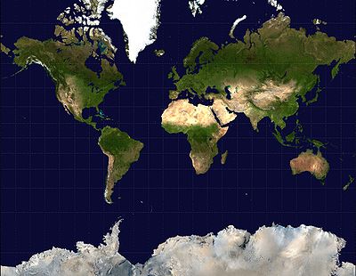
Mercator Map:
This is the one we know and love. It's the least accurate one here.
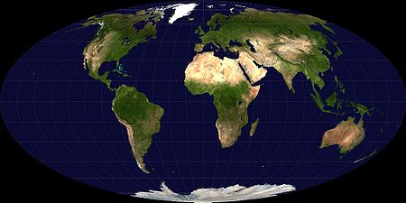
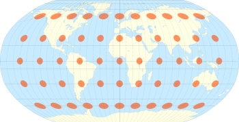
A Mollweide Projection Map
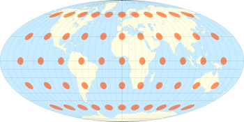
The Mollweide projection with Tissot's Indicatrix of deformation
Reading the Tissot Indicatrix:
If the map was completely accurate all the orange discs would be perfectly circular.
The more the disc is distorted, the more inaccurate the map is in the area of that disc.
A Robinson Projection Map
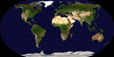
The Robinson Projection with Tissot's Indicatrix of deformation
A Winkel Tripel Map
This is the the most accurate. It distorts most at the poles but less where the most inhabited continents actually are.
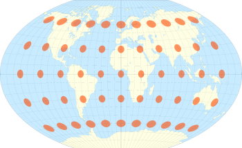
The Winkel Tripel projection with Tissot's Indicatrix of deformation
Choose A World To Live In.
Mercator
Robinson
Winkel Tripel
Lee Vidor
![]()
International Space Station and Shuttle Transit the Sun. Thierry Legault, www.astrophoto.fr
This is what the sun looks like when it is projected on to a flat surface in a similar way to the Earth on maps. Yikes.